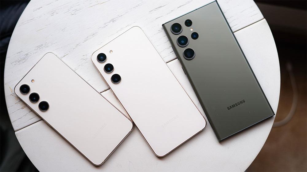
A tech company have taken the best available information on the Galaxy S10 features, the expectations of South Korean design, and put them together into a series of concept renders to illustrate how Galaxy S10s going to look like.
Samsung is maximizing the amount of display available on the front of Galaxy S10. It is also expected to have much narrower bezels at the top and bottom of the display, while the left and right hand sides will continue to have curve round to form Samsung's signature edge.The reduced size of the bezels is also the perfect opportunity for Samsung to replace the earpiece speaker in the top bezel. Space inside the S10 and S10 Plus is going to be tight, with dual-lens (S10) and triple-lens (S10 Plus) camera system demanding a balance between reduced internal volume and significant battery power.
The striking element of the design is that the Galaxy S10 looks pretty much like the Galaxy S9 and S8 families at first glance. Yes there are radical hardware changes, smaller bezels, more screen, but there is nothing that could be labeled new. Of course these are concept renders and the South Korean company may have a bit different approach towards the phone in design department.


